Canadian Parks Council
Non-Profit
Background and Problem Identification
Client Overview:
The Canadian Parks Council (CPC) is a collective of national, provincial, and territorial park agencies in Canada. Their mission is to enhance the park experience for Canadians and to promote the conservation of natural and cultural heritage. They needed a comprehensive digital platform to better engage with the public, share resources, and promote their parks.
Problem/Challenge:
The existing website was outdated, lacked a user-friendly interface, and did not effectively showcase the beauty and importance of Canadian parks. It was difficult for users to navigate, and the site did not provide an optimal mobile experience. CPC wanted a modern, visually appealing, and highly functional website that could cater to the diverse needs of its audience.
Initial Analysis and Approach
Business or Web Analysis:
We conducted a thorough analysis of the existing website and identified key areas for improvement:
-Enhance user experience (UX) and user interface (UI)
-Improve mobile responsiveness
-Streamline navigation and information architecture
-Highlight the mission and work of CPC
-Integrate interactive features and multimedia content
Strategy based on Analysis:
Our strategy focused on creating a user-centric website with an intuitive design, easy navigation, and engaging content. We aimed to capture the essence of Canadian parks through high-quality visuals and interactive elements. Additionally, we planned to implement a content management system (CMS) to allow the CPC team to easily update and manage the site.
Web Structure Design & Development
Layout:
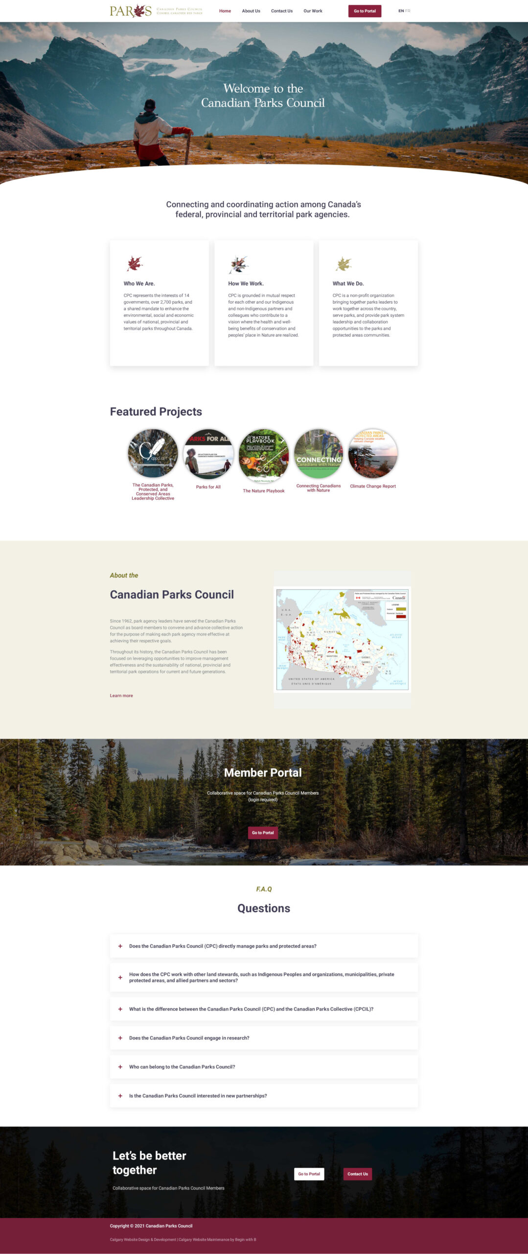
We designed a clean and responsive layout that adapts seamlessly to various devices. The homepage features stunning imagery of Canadian parks, a clear navigation menu, and quick access to key sections.
Typography:
We selected modern, easy-to-read fonts that enhance readability and align with the natural, approachable feel of the site. Headings and body text were chosen to create a harmonious visual hierarchy.
Color:
Our color palette included Mysterious Depths, Beet Red, Olive and Morning Snow. This not only provided visual appeal but also evoked a sense of tranquility and connection to nature.
Functionality:
Key functionalities included:
-Restricted Portal for information and documents sharing
-Multilingual Content (English and French)
-WooCommerce Integrated with Payment API
-Work section showcasing CPC’s past work
-Accessibility features for all users
Result & Outcome
The new CPC website is fast, responsive, and modern, effectively representing the CPC and its mission. The redesign has significantly enhanced user experience, providing an intuitive, engaging, and visually appealing platform for visitors. Additionally, the site includes a restricted portal for secure document and information sharing, ensuring efficient collaboration and resource access for CPC members.

If you’re looking to revamp your website and create an engaging, user-friendly digital platform that truly represents your brand and mission, contact us today. Let’s work together to bring your vision to life and make a lasting impact on your audience. Reach out to us for a consultation and see how we can transform your online presence.

