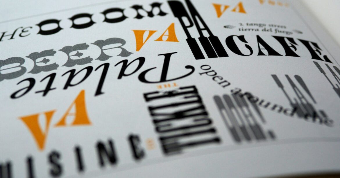
If there’s one obscure thing many people get overwhelmed with when building a website, it’s choosing fonts. Some people think any font goes, while others question what to use for titles versus body text.
The thing is that the right typography not only creates a cohesive design on your website but also impacts how long people stay on your site. Who knew fonts held this much power? This guide will walk you through choosing the right typography, whether for your blog, online store, or portfolio. Let’s dive right in.
Table of Contents
Look at your brand first
Before you even start looking at fonts, you need to sit down and look at your brand. You need to ask yourself, what’s my brand about? You want a font that connects with your brand voice. Is your brand friendly? Formal? Light-hearted? Corporate? Starting here will help you decide the direction you’ll go down, as your fonts play a role in the message you’re trying to communicate to visitors.
If you’re working with a designer or agency, they’ve probably selected fonts that’ll suit your brand. But if you’re doing this on your own, it’s the first thing you need to think about.
Keep the font legible
You may think a handwritten or script font is perfect for your website, but is it easy for your visitors to read? While handwritten fonts may look great in logos, they may be too much for paragraphs. What’s important is that your visitors can understand your messaging. If not, they’ll leave your website and go elsewhere. That said, you want to leave handwritten and script fonts as accent fonts. Clean serif or sans serif fonts are ideal as they’re easy to read and can fit many website designs.
Consistency is key
Building your brand identity means being consistent, whether it’s typography, colour scheme, or messaging. For example, if your homepage title is written in Sans Serif in 40px, make sure the other titles are the same font and size. It may feel like a small detail, but this will create a cohesiveness that’ll help your brand look professional. And trust us, your visitors will notice.
Stick to two or three fonts
It’s easy to get carried away with fonts, and this is why we suggest you stick to only two or three of them. When it comes to fonts, less is more. Websites can easily look messy and overwhelming with various fonts on each page. A good rule of thumb to follow is to choose one font for titles or headers and one for paragraphs. Note that you can also choose a third font for call-to-actions or microcopy.
Go with what works
If you’re overwhelmed with the endless amount of fonts available, you can always opt for commonly used font pairings for your website. These are font pairings that are commonly used on websites.
Here are some font pairings for your heading and body fonts that are popular among designers:
- Playfair Display & Fira Sans
- Source Serif Pro & Source Sans Pro
- Montserrat & Source Serif Pro
- Roboto Slab & Roboto
- Merriweather & Merriweather Sans
You can play around with these pairings on your website and see which ones connect with your overall design. If none of these speak to you, online resources like Google Fonts can show you other options to choose from.
Building a website is like putting a puzzle together, where it takes time to find the right fit. If you’re feeling overwhelmed with the process of building a website, why not work with an expert web design service like Begin With B? From brand and logo development to web design, we’re here to guide you through the process and grow the brand you’ve been dreaming of.