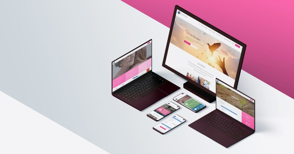
Having a website for your business is essential in today’s digital landscape. It acts as the first introduction to your brand, and it is important to focus on creating a message that conveys value. Before starting the design process, you must understand your niche and use target keywords that describe your product or service. Testing the subpages is also important to make sure they are loading properly.
However, there is another factor that businesses often overlook – colour psychology. Colour has the power to evoke different emotions from users, capture their attention and show hierarchy within the pages of a website. Knowing how colours affect customer engagement can be beneficial in order to optimize and drive success.
For this reason, it is important to take into account colour psychology when designing a website. It can help you boost engagement with your target audience and increase the overall effectiveness of your website.
Table of Contents
Understanding Colour Psychology
When it comes to colour psychology, there are six primary colours that can be used to influence customer behaviour. Red is a powerful colour that conveys emotions such as passion and excitement. Blue is calming and trustworthy, while yellow represents creativity and energy. Green symbolizes growth, and orange shows enthusiasm. Finally, purple reflects luxury and sophistication.
These colours can be further divided into two categories – warm tones (reds, oranges, yellows) and cool tones (blues, greens). Warm tones tend to evoke more of an emotional response from viewers, while cooler shades provide a sense of trustworthiness. It is important to understand the psychological effects of each colour and how it affects customer engagement.
Biggest Benefits of Using Colour Psychology on Your Website
Using colour psychology on your website can have a huge impact on customer engagement. It can be used to create an emotional connection with visitors and influence their behaviour. Here are some of the biggest benefits of using colour psychology on your website:
1. Increase Conversions – Colour has been shown to increase conversions by up to 80%. This is because certain colours evoke emotions that encourage customers to take action, such as purchasing a product or signing up for a newsletter.
2. Attract Attention – Bright, bold colours capture attention and draw users in. This allows you to highlight important elements of your website, such as calls to action or headlines.
3. Create Brand Recognition – Using consistent colour schemes across all pages of your website can help create a sense of familiarity for visitors and make it easier for them to recognize your brand.
How to Use Colour Psychology on Your Website
Once you understand the basics of colour psychology and its benefits, you can start using it to improve the effectiveness of your website. Here are some tips on how to use colour psychology:
1. Choose One Primary Colour – Pick one primary colour that best represents your brand and use it across all pages of your website. This will help create a sense of consistency and make it easier for visitors to recognize your brand.
2. Use Contrasting Colours – Contrasting colours can be used to draw attention to key elements on the page, such as calls to action or headlines. You can also use contrasting colours to create a hierarchy and organize information in an understandable way.
3. Test Your Colour Scheme – It’s important to test different combinations of colours and see how they affect customer behaviour before committing to a colour scheme for your website. This will help you determine which colours are most effective at driving conversions.
Conclusion
Colour psychology is a powerful tool that can be used to improve the effectiveness of your website and drive customer engagement. By understanding how colours evoke emotions, you can use them to create an emotional connection with visitors and influence their behaviour.
We at Begin With B offer a wide range of design services, including website design. We use colour psychology to ensure that your website stands out from the competition and drives conversions. Contact us today to learn more about how we can help you create an effective website for your business.


